Part 1 - Definition and Discussion of Benefits and Challenges
Resources for this article:- http://www.luminous-landscape.com/tutorials/duotone.shtml
- http://en.wikipedia.org/wiki/Duotone - very weak, perhaps some of the better material from this exercise should be directed to submitting to wikipedia.
- http://www.graphic-design.com/Photoshop/duotones/index.html
- http://www.pstut.com/tutorial-duotone.html - short and to the point
- http://www.photoshopsupport.com/tools/actions-tutorials/duotone-tritone-quadtone-actions-tutorial.html - very thorough but with a lot of ads
- http://www.creativepro.com/node/58522
- http://help.adobe.com/en_US/Photoshpp/11.0/WSfd1234e1c4b69f30ea53e41001031ab64-778ca.html
- Using Adobe Photoshop CS4.pdf
Discussion
Duotones are a process for presenting an image/photo using only two colors or two color tonalities. One color provides the background and main coloration while the second color generally is used for complimentary or contrasting highlighting. Designers use this process to create striking black and white tonal images, aged-looking sepia tones or brash contemporary color effects. When done using the common black and white tones, this process produces an effect like the older black and white photos. Another popular color scheme is to produce a duotone that looks like the older sepia photographs. While the black and white and sepia duotones are very common, the designer is not limited to to these two color schemes since any color pairing can be used to achieved the desired artistic effect. The photos below, from akvis.com, show an original black and white photo on the left and its resulting sepia duotone on the right.
Duotones work best when the initial photo have some interesting details that will benefit from this process of highlighting. I see this particularly useful in landscapes, images of buildings and images that have a lot of angularity to them that the second coloration can emphasize. Another application would be for highlighting one item or aspect in a photo such as a white crane amidst a dark building or landscape.
One reason duotones have had a resurgence of interest recently is that inkjet printers just can't print the many tonalities of blacks from just one cartridge. Using Photoshop to create duotones, or even tritones and quadtones, a wider range of black tonalities can be achieved. One advantage to using this method is printing cost containment. Having an item printed in many colors can be rather expensive as I discovered when I had the newsletter printed for my homeowner's group. I've never had a job printed commercially in color such as a photographic quality poster, but I can imagine that it would be very expensive. By limiting the color ranges to just two, this should cut the costs substantially.
However there are challenges in doing this. As an graphic artist creating a great duotone I rely on the images being reproduced the same as what I'm seeing on my own monitor regardless of my monitor's settings. But, each printer has a unique calibration and library of color outputs. Therefore, what gets produced from a printer may not match what I see on my monitor. Therefore I can't be guaranteed that a printing of my great work will be reproduced the same as what I've produced. The same is true for placing my duotone on a web site. The consumer of the website might have different monitor settings which will not reproduce the image as I intend. Either way it is challenging to get exacting color reproduction but for a professional project, then the designer needs to work with the printer to make sure that the colorations are as intended. But these issues are probably the same whether I'm producing a duotone, monotone or full color item. There is no 100% certainty in exact reproduction from my original to the reproduction.
Creating Duotones
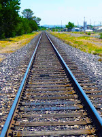
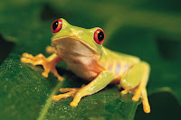
Reading the histogram will reveal a lot about the image's tonal composition and if the image is a good candidate for transformation to a duotones. The lines on the histogram represent the brightness value of each pixel and the height of the bar indicates the quantity of pixels with that value. The total graph reveals the range and brightness values of the image. The image needs to have a good range of tones with highs at the right (white/light tones) and left (blacks).I've created several duotones, but I'm not really happy with them yet. The first one is a composite using a photo I took of a of railroad tracks in Marfa, Texas and the other is the yellow frog from one of the stock photos.
These are the original photos:


And this is the resulting duotone composite:
I realize that my little froggie is too small and not distinctive enough. I'd hoped he would stand out and this would be a humorous piece. Need to keep trying. I had earlier created this one using the bird in the tutorial (which I had trouble capturing) and a river scene in upstate New York.

