A Bit of This and Bit of That
While this started out as a writing blog which has been sorely neglected, it's being converted to another use. Now that I'm learning to use photoshop, I want to post some of my art work. You'll still find the writing blog under the Thinking in Text tab.
Wednesday, July 28, 2010
Thinking in Photoshop
There are some things that I feel I'm missing. I've not gotten to the stage when I can think in Photoshop. By that I mean when I have a project to do, I'm not sure where to start or what assets I need. I also know that I need to learn more about Photoshop layers. I think there are a number of "tricks" to using them. I found a great book on Layers that is a lot of text with models that I plan to go through.
This summer I'd really thought I would have plenty of time to devote to my garden and yard and work on the website. I haven't had time to provide any new content. I really need to tend to that.
This has been a good learning experience, now I need to apply it.
Magazine Cover - Final Project
 | |||
| Final Magazine Cover for Urban Saratoga Gardening |
This has been a tough class for someone who knew very little about Photoshop at the beginning. At one point I was about to throw in the towel. But I knew that my fall semester will also be very busy and decided to finish. I know I have a lot more to learn, but I can continue on my own. I've learned a lot. I'm glad I hung in there.
Tuesday, July 27, 2010
Magazine Covers - Written Assignment
Monday, July 26, 2010
Depth of Field
 |
| Sailing under the Golden Gate with depth of field |
Masks
 |
| Using a Mask to create a Composite |
Part 2 - Using the Mask Palette
This was a fun exercise. Of course there wasn't a lot of work to do since the author had created all effects in layers and it was merely an exercise of turning things on.
 |
| Using the Mask Palette |
Sunday, July 25, 2010
Using Plug-Ins
 |
| Use of a plug-in to style the title |
Thursday, July 22, 2010
Surrealism
Tuesday, July 20, 2010
Image Enhancement - Retouching & Healing
 |
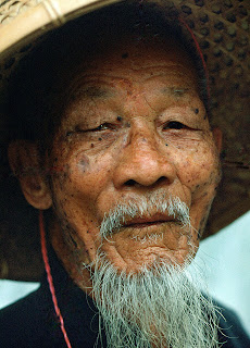
| Healed Bluebeard |
Here are the two faces of Hannah that I've practiced retouching. I found this a very interesting tutorial. I'm sure that I have many images that will benefit from these skills. I look forward to working on them when I finish this class and have more time.
 |
| Face of Hannah |
 |
| 2nd Face of Hannah |
Question for my fellow students. Are any of you using supplemental books or web tutorials? Could you share the titles and/or locations of those items you find more useful than our textbook?
Monday, July 19, 2010
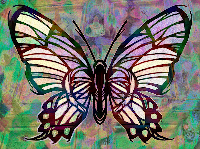
Coloring Line Art - The Butterfly
My coloration might not be as dark as in the text, but I like my butterfly.
 |
| Colorful Butterfly |
Mid-Term Project: Paul Masson Winery
I did a lot of research on Masson using winery industry files and the Saratoga Historical Society. For the collage, I tried to create the impression of "legendary" and "aged". I'm still having trouble with masking, so I had to use other selection tools. I'd really wanted a picture of Masson, but was unable to find one. Most of the images I found were very small and needed enlargement. I'm learning that half the battle is finding suitable images requiring a lot of time or some good personal photographs. Plus there are other design ideas I have, but I don't have the skills to pull them off, yet. I'm not entirely pleased with this and would like to come back to it later for further refinements.
Paul Masson Winery in Saratoga
At the Paris Expo of 1900, Paul Masson Champagne stunned the world’s oenophiles by winning its prestigious Paris Award. The Masson brand brought the California winery industry (and its Santa Clara Valley appellation) to the forefront of wine lovers worldwide. And that reputation of innovation and hard work forms the basis of Santa Clara Valley’s success in the modern world.
Leaving his family’s reputation and vineyards behind, Paul Masson came to the US in 1878 from the Burgundy region of France. Here he met up with Charles Lefranc, another transplanted Frenchman and winemaker. The two experimented using Lefranc’s imported French vines with grafts from “Mission” vines from nearby Franciscan padres. Their work resulted in great wines that brought business success and celebrity for both Masson and Lafranc in Santa Clara Valley and San Francisco. Masson eventually married Lafranc’s daughter and set up his own winery in the hills above Saratoga. His mountain winery completed in 1905 was named “La Cresta.” The 1906 earthquake destroyed most of the winery and in rebuilding the he acquired the 12th century portal from the ruins of St. Patrick’s Cathedral of San Jose.
From this location he produced fine wines and even supplied sacramental wines during Prohibition. With most of his fortune gone and now a widower by the time Prohibition was repealed, he sold the mountain estate to Martin Ray in 1936. Ray, who had worked at the winery as a youngster, kept the Masson brand and reported that Paul Masson visited his former mountain estate up until his death at 82 in 1943.Martin Ray eventually sold the Masson Brand to the Seagram’s. It’s had several owners since then. An amphitheater was added and the property began its second life as a concert venue.
In the late 1950’s, the Masson brand needed an easily accessible location for its products. So it hired the notable architect John Savage Boles to design a modern tasting cellar to be located on Saratoga Ave. Bolles, noted for Bay Region Modernism, contributed more than 500 different structures including Candlestick Park, the Macy’s at Valley Fair, IBM buildings in SJ, and the Fremont GM plant. The famed photographer Ansel Adams documented the construction of the Champagne Cellars in an exhibition which eventually appeared at the Smithsonian.
The Champagne Cellars were razed in the early 1990’s for a housing development. While the Champagne Cellars have been replaced by housing, the historic Paul Masson Mountain Winery still stands in homage to the legacy and success of the Santa Clara Valley agricultural and winery innovators. On many nights when the lights are visible on the hill off Pierce Road, it’s easy to imagine the wonderful events that have taken place up there over the years. The Mountain Winery still epitomizes fine living with music, entertainment, and of course, a glass of champagne.
Sources:
- http://en.wikipedia.org/wiki/History_of_California_wine
- http://www.kipnotes.com/beverages.htm
- http://www.flickr.com/photos/14696209@N02/sets/72157622875749578/detail/
- http://www.flickriver.com/photos/14696209@N02/4135384406/
- http://www.flickr.com/photos/14696209@N02/3632191421/in/set-72157621559636512/
- http://synthetrix.blogspot.com/2008/03/paul-masson-champagne-cellars-saratoga.html
- http://www.nps.gov/nr/travel/santaclara/mas.htm
- http://www.santaclarawines.com/index.php/wineries-of-santa-clara-valley-history/
- http://www.mountainwinery.com/history /?WSDSESSID=2f6a48918ee6bcd9a9d89ee56a37cde2&/1/
- http://www.saratogahistory.com
- http://www.herecomestheguide.com/location/detail/mountain-winery/
- http://www.sfhistoryencyclopedia.com/articles/b/bollesJohn.html
Thursday, July 15, 2010
Incorporating Text into Graphics
I did a few adjustments to the photo to sharpen the contrasts and bring out the shadows in the clouds. I thought that was representative of her situation. In doing so it brought out more of the blue in the sky which complimented the text color.
While this is just a simple incorporation of text in a photo, I'm pleased with it. In fact it looks like an inspirational poster or greeting card that you might find in the rack at the Hallmark store. I hope you enjoy it and that it speaks a positive message of beauty and hope.
The second image assignment in the typography assignment was to complete the Chief Executive ad. Here's my final copy of that.
Saturday, July 10, 2010
Homework 4 - Colorize a Greyscale Image
I choose to colorize the woman in a hood image from the tutorial. In colorizing this image I found that there were fewer colorations available while with the duotone the number seemed to be infinite. This process seems a more limiting in that the tutorial didn't recommend using any of the other color tools such as levels and curves. In this regard the changes that I made seemed much more limited where as in the removing coloring I could more finely tune the amount of dark and light using the curve and level tool. This image is ok, but it is not something that I like.
Saturday, July 03, 2010
Duotones
Part 1 - Definition and Discussion of Benefits and Challenges
Resources for this article:- http://www.luminous-landscape.com/tutorials/duotone.shtml
- http://en.wikipedia.org/wiki/Duotone - very weak, perhaps some of the better material from this exercise should be directed to submitting to wikipedia.
- http://www.graphic-design.com/Photoshop/duotones/index.html
- http://www.pstut.com/tutorial-duotone.html - short and to the point
- http://www.photoshopsupport.com/tools/actions-tutorials/duotone-tritone-quadtone-actions-tutorial.html - very thorough but with a lot of ads
- http://www.creativepro.com/node/58522
- http://help.adobe.com/en_US/Photoshpp/11.0/WSfd1234e1c4b69f30ea53e41001031ab64-778ca.html
- Using Adobe Photoshop CS4.pdf
Discussion
Duotones are a process for presenting an image/photo using only two colors or two color tonalities. One color provides the background and main coloration while the second color generally is used for complimentary or contrasting highlighting. Designers use this process to create striking black and white tonal images, aged-looking sepia tones or brash contemporary color effects. When done using the common black and white tones, this process produces an effect like the older black and white photos. Another popular color scheme is to produce a duotone that looks like the older sepia photographs. While the black and white and sepia duotones are very common, the designer is not limited to to these two color schemes since any color pairing can be used to achieved the desired artistic effect. The photos below, from akvis.com, show an original black and white photo on the left and its resulting sepia duotone on the right.
Duotones work best when the initial photo have some interesting details that will benefit from this process of highlighting. I see this particularly useful in landscapes, images of buildings and images that have a lot of angularity to them that the second coloration can emphasize. Another application would be for highlighting one item or aspect in a photo such as a white crane amidst a dark building or landscape.
One reason duotones have had a resurgence of interest recently is that inkjet printers just can't print the many tonalities of blacks from just one cartridge. Using Photoshop to create duotones, or even tritones and quadtones, a wider range of black tonalities can be achieved. One advantage to using this method is printing cost containment. Having an item printed in many colors can be rather expensive as I discovered when I had the newsletter printed for my homeowner's group. I've never had a job printed commercially in color such as a photographic quality poster, but I can imagine that it would be very expensive. By limiting the color ranges to just two, this should cut the costs substantially.
However there are challenges in doing this. As an graphic artist creating a great duotone I rely on the images being reproduced the same as what I'm seeing on my own monitor regardless of my monitor's settings. But, each printer has a unique calibration and library of color outputs. Therefore, what gets produced from a printer may not match what I see on my monitor. Therefore I can't be guaranteed that a printing of my great work will be reproduced the same as what I've produced. The same is true for placing my duotone on a web site. The consumer of the website might have different monitor settings which will not reproduce the image as I intend. Either way it is challenging to get exacting color reproduction but for a professional project, then the designer needs to work with the printer to make sure that the colorations are as intended. But these issues are probably the same whether I'm producing a duotone, monotone or full color item. There is no 100% certainty in exact reproduction from my original to the reproduction.
Creating Duotones
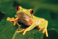
Reading the histogram will reveal a lot about the image's tonal composition and if the image is a good candidate for transformation to a duotones. The lines on the histogram represent the brightness value of each pixel and the height of the bar indicates the quantity of pixels with that value. The total graph reveals the range and brightness values of the image. The image needs to have a good range of tones with highs at the right (white/light tones) and left (blacks).I've created several duotones, but I'm not really happy with them yet. The first one is a composite using a photo I took of a of railroad tracks in Marfa, Texas and the other is the yellow frog from one of the stock photos.
These are the original photos:


And this is the resulting duotone composite:
I realize that my little froggie is too small and not distinctive enough. I'd hoped he would stand out and this would be a humorous piece. Need to keep trying. I had earlier created this one using the bird in the tutorial (which I had trouble capturing) and a river scene in upstate New York.
Wednesday, June 30, 2010
Getting Organized
Monday, June 28, 2010

How about some changes!
When I first started this blog, I thought I'd be very diligent and post a writing at least once a week. Well, I did one, and then another 5 years later. Hardly consistent or reflecting any kind of diligence.
So, like lots of folks let's reinvent this blog. My interests in technology and social media haven't waned. In fact they've grown. But along the way, I've learned a lot and have decided to get out in the front and create some stuff. It's nice to work on a big commercial site and see work that you've done appear. Or, more accurately ...work that you had a very, tiny, tiny role in creating. It's much riskier to create your own page with text and images and put that out there.I guess I've never been that confident to take those risks. Now, I feel comfortable putting my own work out there. Just as the nike slogan goes, "Just Do It. "
As part of this new risk taker image I've launched my gardening web site. It's still very tiny with just a few pages, but in time it will grow. You can view it at urban saratoga gardening. It's a site devoted to one of my life-long hobbies: gardening. Since I've taken web development and Dreamweaver classes, I can now create my own site. And to help me develop good content and reasonable art work for that site, I'm taking a class in Photoshop this summer. The instructor wants us to post assignments into a blog. So, I'll be using this blog for that.
The photo that appears at the top of this blog is a "before" photoshop. This is probably my most favorite plant: a lavender rhododendron. Despite objections from my gardener I bought it in Home Depot for about half what it would have cost at a "professional" nursery. I put in a shady corner of my front yard and it has just bloomed away every year. It never disappoints me. Last year I got very brave and did some trimming to shape the plant a bit. I didn't want it getting just tall, but rather to be shorter in the front and taller in the back. It survived my clippers and put on a nice show this spring. Maybe I'll find a way to use the photo in one of my assignments.


